
Go Kiosk
Designing a seamless user experience for Smart Automated Retail Kiosks, enhancing intuitive interactions for product selection and purchase.
Role and Responsibility
User Research: Desk research, competitive analysis, user surveys, and interviews
UX Design: Sketching, Wireframing, Interaction Design, Prototyping
Branding : Mood Board, Concept generation
Collaboration: Cross-Functional Team Collaboration (Designers, Developers, Product Managers)
Platform
Duration
Touchless Kiosk
Mobile (IOS and Android)
8 Months
Aug 2022 - March 2023
Tools Used
Figma, Adobe Illustrator
Adobe Photoshop
Project Background
To expand quick-access shopping for daily essentials, Amazon introduced Amazon Kiosks—app-linked vending machines in apartment complexes. offering everyday essentials faster than instant delivery.
Launched with selected locations in Bengaluru, this initiative aligns with Amazon’s grocery strategy—blending marketplace, quick delivery (Amazon Fresh), and physical retail.
With a scan, pick, and go model, Amazon Kiosks redefine frictionless shopping, competing with BigBasket’s BB Instant and other automated retail players.
The Situation
Amazon is constantly innovating to enhance customer convenience, and the rise of hyperlocal shopping behavior presented an opportunity to streamline everyday purchases. Traditional vending machines lacked smart integration, and quick-commerce services often fell short on accessibility and reliability.
A product manager approached with the vision of designing a Smart Automated Retail Kiosk Experience—a touchless, app-connected vending solution that delivers a frictionless shopping experience. The goal was to create an intuitive, secure, and efficient human-machine interaction, allowing users to seamlessly purchase essential items with minimal effort - bridging the gap between digital convenience and physical retail accessibility.

?
How might we bridge the gap between digital convenience and physical retail to optimize product selection and availability based on user demand while creating a seamless, intuitive, and faster purchasing experience ?
India has more than
65 lakhs
possible location in more than 500 Indian cities, where vending machine can be installed.
The Indian Vending machine market is expected to witness a substantial growth of
14.9%
CAGR (Compound Annual Growth Rate) during 2020 to 2026
* Source: ResearchandMarket; 6W Research
Competitor Analysis

+ What I have Learn?
Looking into competitor research from existing vending machine interface and technology and white papers I was able to identify recent trends and patterns in vending machine market. Some notable insights marked is:
+ More convince in operating the Kiosk and app interface.
+ Process should be simpler and time saving.
+ Multiple payment options for easy payment transactions.
+ Clear and simple visual design to include all the product in an effective way.
+ Easy ingress to navigate how to use the Kiosk without any third party interference.
Survey and Interview
We have conducted user survey at Banglore, India and around 20 interviews of existing users and 15 interviews of users who never operated Kiosk to get feedback from existing experience and their expectation.
+ Create a smart experience which requires no external help in the journey.
+ Create simple and minimal interface experience which feels classy and premium.
+ Ensure clear and straightforward communication about the product.
+ Make the process of application easy for users by giving clear navigation.
+ Reduce the length of process for choosing desired products to save time.
Target Audience
Core Demographic: Men and Women aged 25+ to 45
Peripheral Demographic: Young Adults, 45+
Tier 1+ urban dwellers of residential complexes

Tier 1+ office goers

Gender Agnostics


Young Adults
User Personas


Brand Positioning : Convenience, Grab-and-go/ scan-pick-go, Fast and time saving
For the users who want to fulfil their top-up needs quickly, Go Kiosk becomes the destination that makes t. life convenient.
Brand Personality : Reliable, Next door store, Refreshingly magical, wow and smart
Product Response : Magical, Quick, Easy and convenient
Design Purpose : When placed side by side with other Kiosks particularly that of competitors, Go Kiosk should capture attention and attract customer to it. This should be Kiosk of choice. It should be premium and classy, abstract and minimalistic.
Brand Personality : Reliable, Next door store, Refreshingly magical, wow and smart
Design Purpose : When placed side by side with other Kiosks particularly that of competitors, Go Kiosk should capture attention and attract customer to it. This should be Kiosk of choice. It should be premium and classy, abstract and minimalistic.
Mood Board


abstract
Movement
Magical
Soothing
Minimal
Premium
# 000000
# F76328
# F98324
# FA9D20
# FAFAFA
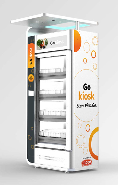
Kiosk Design and Branding
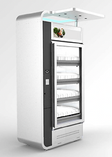
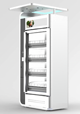
A smart instant retail Kiosk, enabled with IoT and advance technology that allows customers to open door like refrigerator, take products they want and walk out. User can choose from multiple payment option which ensures contactless payment for safety and hygine.
. Kiosk Design


1

2

3
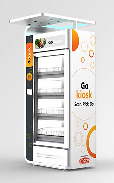
FInal Branding .
. Branding Concepts .
Yellow orange conveys happiness, excitement and enthusiasm
Circles represent wholeness, a natural sense of completion

Ring representing a cycle or continuing action.
Business Origami
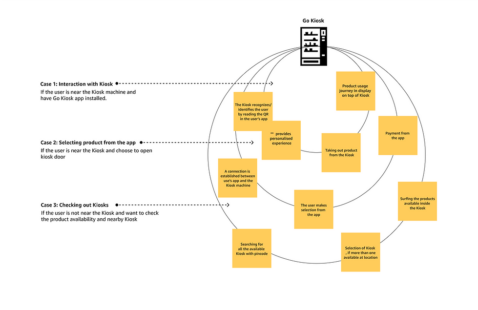
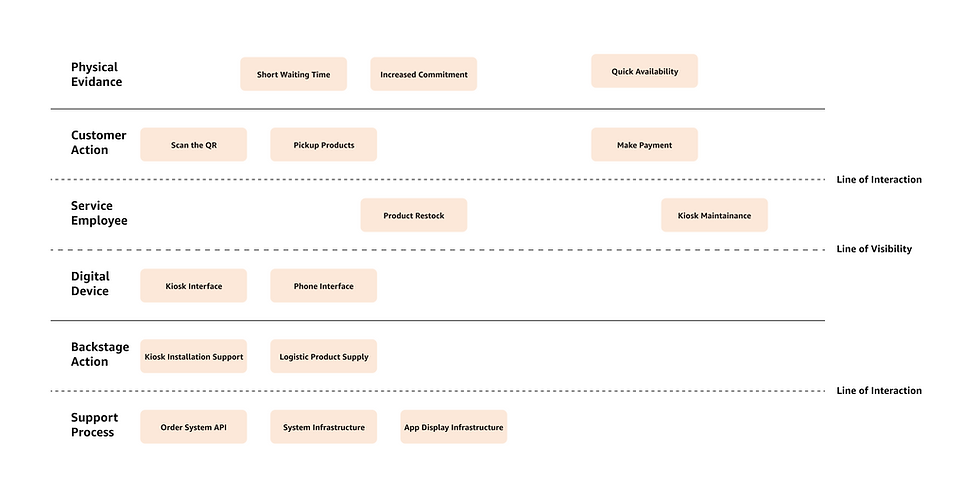
Service Blueprint
User Journey
Research and Analysis
What I Did?
+ Conduct user interviews (20+ in person and 10+ online) to get wider pictures of their expectations.
+ Benchmark analysis was done on BB instant kiosk. The usability of the application was analysed. Google store and App store comments were rewired.
+ Field study was conducted for local fresh food, packaged food and health product vending machine based out in Bangalore. observational study and interview has been carried out to check the usability
and functionality of the app and vending machine.
Low- Fi Wireframes

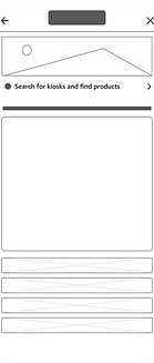
Ingress for searching more kiosk locations & product availability
List of products available on each tray
Onboarding screens for educating user about the system
* Pop up notification

High- Fi Wireframes


Style Guide


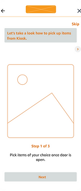
On Boarding screens.
Recognizing the importance of introducing new product effectively, we've designed a user-friendly onboarding screen.
+ This screen presents a simplified and practical step-by-step guide, ensuring users can effortlessly grasp the process and seamlessly proceed with their shopping experience.
+ This approach is tailored to enhance user engagement and understanding, resulting in a more enriched customer journey.
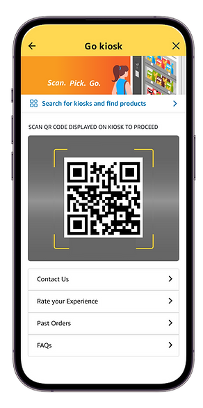
Scan QR code.
Users can effortlessly scan the QR code visible on the kiosk. Moreover, they can explore further by conveniently searching for nearby kiosks in their vicinity.
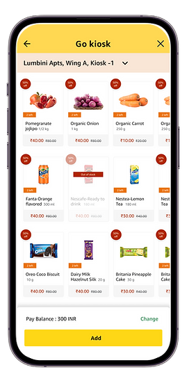

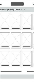
Product checklist.
+ Users can effortlessly view the assortment of products on every tray of the kiosk.
+To facilitate convenient product display and listing, implemented elegantly designed product cards which enable users to effortlessly add products to their carts, streamlining the shopping experience.
+ Additionally, users have the privilege to access a comprehensive overview of product availability across all nearby kiosks conveniently from the dropdown at the top of the page.
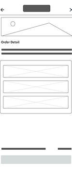
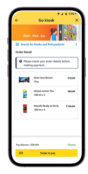
Cart Page.
+ Created a sleek, minimalist, and highly functional cart page that ensures a user-friendly step-by-step transaction process.
+ The arrangement of information follows a clear hierarchy, enhancing convenience.
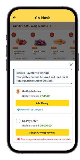
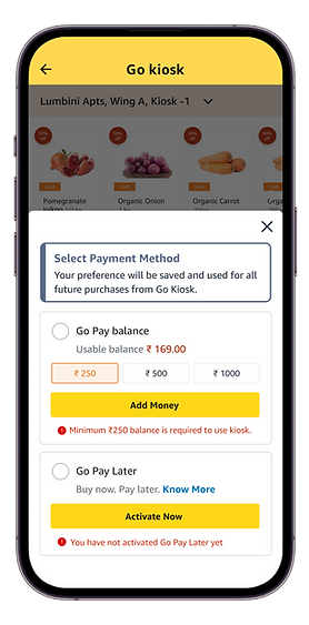
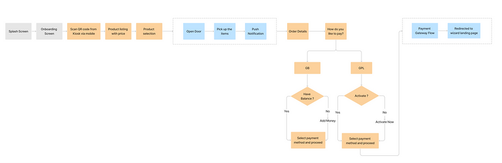
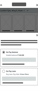
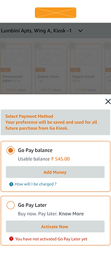
Payment Flow
Key Learnings
+ Comprehensive understanding of the product ecosystem, including IoT-enabled kiosk and ML-based product availability check.
+ Gained insights into designing processes that streamline interactions and create inclusive designs across multiple devices.
+Demonstrated leadership and effective collaboration within cross-functional teams in an agile work environment.
+ Enhanced critical thinking skills by effectively merging business requirements with user needs, ensuring solutions align with both strategic objectives and user expectations.